
Hey there, folks! Today, we’re diving headfirst into the wild world of call-to-action (CTA) examples. If you’ve ever surfed the web, chances are you’ve bumped into these little guys more times than you can shake a stick at. From those ‘Buy Now’ buttons to ‘Sign Up’ nudges, CTAs is like the secret sauce behind a website’s success. So, fasten your seatbelts ’cause we’re about to take a wild ride through the CTA wonderland!

CTAs: The Unsung Heroes
First things first, let’s give CTAs the love they totally deserve. These little things are like the digital bouncers at the internet’s hottest nightclub, guiding visitors straight to the VIP section. They’re the difference between someone casually checking out your content and them going all-in. So, let’s break it down with some real-life CTA examples.
“Get Started” – The Classic CTA
We’re kicking things off with a classic, and you’ve probably bumped into this one a zillion times. It’s like that reliable old buddy who’s always got your back. When you see “Get Started,” it’s like someone waving you over to embark on an exciting adventure. Clicking it are likes shouting, “Let’s do this!” Boom! Instant engagement. It’s the go-to choice for websites looking to initiate user interactions effortlessly.
“Subscribe Now” – The Content Lovers Delight
Now, if you’re all about content creation or you’re a newsletter junkie, “Subscribe Now” is your jam. It’s like rolling out the red carpet and inviting someone to join your exclusive club. Who can resist the siren call of fresh content and behind-the-scenes info? This CTA establishes a direct connection with content enthusiasts, promising regular, high-quality updates and insider knowledge.
“Join the Revolution” – The Rebel Yell CTA
Sometimes, you’ve gotta shake things up and ignite people’s inner rebels. “Join the Revolution” are like the CTA version of a punk rock anthem. It screams, “Hey, we’re tossing the rulebook out the window, and you should too!” It’s perfect for those who want to change the world, one click at a time. This CTA encourages visitors to be part of something transformative, to be bold, and to think way outside the box.
“Give Me the Scoop” – The Gossip Girl CTA
We all know that one persons who can’t resist the latest gossip, right? “Give Me the Scoop” taps into an inner gossip girl or guy in all of us. It’s like the virtual equivalent of leaning in and whispering, “I’ve got some juicy secrets to share.” This CTA plays on our insatiable curiosity, offering a sneak peek into exclusive information, making it a must-have for entertainment and news-related sites.
“Limited Time Offer” – The FOMO Generator
“FOMO (Fear of Missing Out) are real, my friends, and this CTA capitalizes on It.’Limited Time Offer’ is like that blinking neon sign outside your favorite bar – you can’t ignore it. It’s the digital equivalent of telling someone, ‘Hurry or you’ll miss out on the deal of a lifetime!’ This CTA generates urgency, compelling visitors to take action swiftly, making it indispensable for e-commerce, sales, and event promotions where timing is crucial.”
Start Crushing It” – The Motivational CTA
We all need a little pep talk sometimes, right? “Start Crushing It” is like the virtual version of a personal trainer shouting, “You’ve got this!” It’s the ultimate motivator, making you believe you’re about to conquer the world, one click at a time. It’s the go-to choice for websites aiming to inspire and empower visitors to take action and achieve their goals.
“Get Your Free Trial” – The Risk-Taker’s CTA
Who doesn’t love free stuff, especially when it’s attached to no-strings-attached trials? “Get Your Free Trial” is the CTA that says, “Why not give it a shot?” It’s the perfect choice for the curious cats and the risk-takers in the crowd. This CTA is a welcoming invitation for visitors to test the waters without commitment, ideal for SaaS companies, app developers, and those confident in their product’s quality.
“Let’s Chat” – The Friendly CTA
When you want to foster a sense of community and approachability, “Let’s Chat” is your go-to. It’s like extending a friendly hand and saying, “Come, let’s have a chat.” It’s the digital equivalent of a warm and welcoming smile. This CTA is a bridge to connect, to engage in a conversation, and to from personal connections with your visitors, particularly suitable for customer support and social platforms.
“Score Big!” – The Competitive Edge CTA
Are you into games, competitions, or challenges? “Score Big!” is your kind of CTA. It’s like the starting pistol at a race, urging you to sprint toward victory. Clicking this CTA is like saying, “Game on!” This CTA creates an atmosphere of excitement, rivalry, and achievement, making it a must-have for gaming websites, sports platforms, and contest-based businesses.
“See the Magic” – The Curiosity CTA
Curiosity didn’t just kill the cat; it also makes people click on CTAs like “See the Magic.” It’s like peeking behind the curtain at a magic show. The mystery of what’s on the other side is simply irresistible. This CTA thrives on the human desire for discovery, making it perfect for websites that offer unique or extraordinary experiences, like virtual tours or unboxing videos.
“Get Swiping” – The Tindeer of CTAs
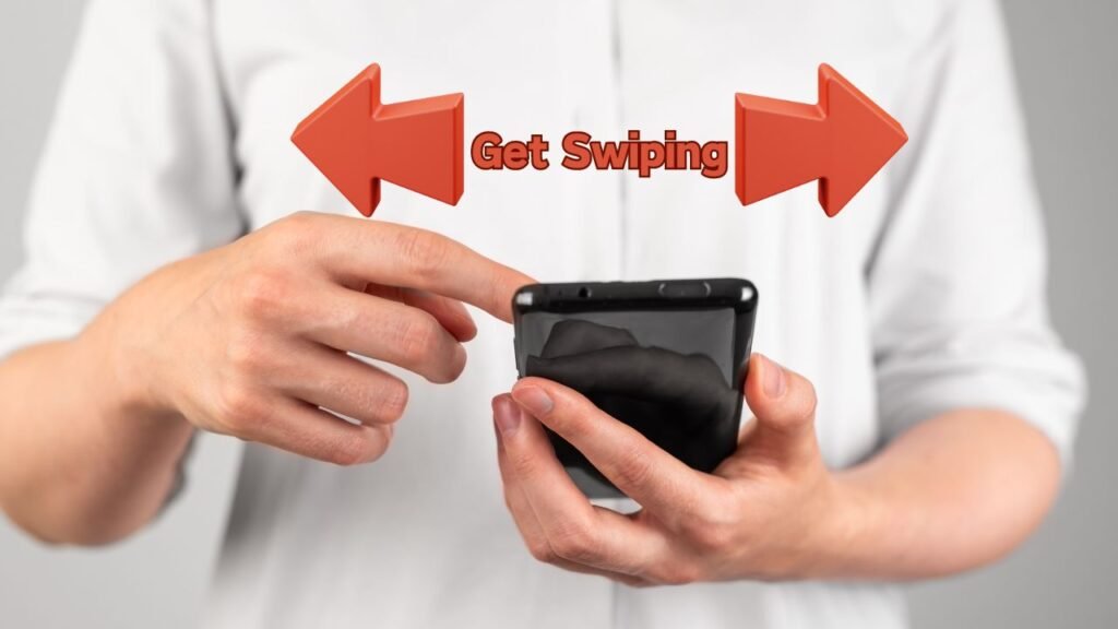
In the world of online dating apps, “Get Swiping” is the CTA equivalent. It’s all about making quick decisions and seeing what’s out there. If you’re in the business of making connections, this one’s for you. This CTA mirrors the experience of swiping right or left, making it a playful and engaging choice for dating apps, networking platforms, and sites where matching and connections are central.
“Make it Happen” – The Action-Packed CTA
“Make it Happen” is like the CTA version of a superhero’s call to action. It’s motivating, empowering, and gives you that push you need to take action. If you’re all about results, this one’s your sidekick. This CTA instills a sense of agency and accomplishment, ideal for productivity and goal-oriented websites, and motivating users to achieve their aspirations.
“Be the Boss” – The Entrepreneur’s CTA
Entrepreneurs and go-getters, listen up! “Be the Boss” are your battle cry. It’s like a digital gavel that says, “You’re in charge now.” This CTA screams independence and self-reliance. It’s the perfect choice for businesses that empower users to take control, start their ventures, or assert their autonomy.
“Don’t Miss Out” – The Gentle Nudge CTA
Subtle, but effective, “Don’t Miss Out” is the friendly reminder that we all need from time to time. It’s like saying, “Hey, just in case you forgot, this are something you’d regret not checking out.” This CTA creates a sense of urgency in a gentle way, ideal for promotions, limited-time offers, or events that visitors shouldn’t overlook.
“Take the Plunge” – The Adventure-Seeker’s CTA
Adventure seekers and thrill junkies, here you’re CTA: “Take the Plunge.” It’s like the edge of a cliff, daring you to leap into the unknown. The thrill of taking a risk is hard to resist. This CTA appeals to those who crave excitement and exploration, making it the prime choice for adventure travel companies, outdoor gear shops, and experiences that promise adrenaline rushes.
“Find Your Tribe” – The Social Butterfly CTA
If you’re all about building a community and finding your people, “Find Your Tribe” is the CTA for you. It’s like sending out a virtual bat signal to gather like-minded individuals. Who can resist the allure of belonging? This CTA encourages users to form connections and become part of a supportive community, making it an excellent fit for social networks, forums, and niche interest groups.
“Level Up” – The Gamers’ CTA
For all the gamers out there, “Level Up” is the ultimate CTA. It’s like getting the secret code to unlock new abilities. Clicking it feels like you’re embarking on a quest for greatness. This CTA speaks directly to gamers, promising a journey of advancement and achievement, making it perfect for gaming websites, forums, and communities.
“Ready to Rock?” – The Rockstar CTA
Musicians, artists, and performers, listen up! “Ready to Rock?” is the CTA that lets you step into the spotlight. It’s like the digital equivalent of stepping onto a stage, ready to dazzle your audience. This CTA appeals to creative’s, promising a platform to showcase their talents and gain visibility.
“Get in the Zone” – The Zen Master CTA
For those looking for serenity and peace, “Get in the Zone” is the CTA that guides you toward mindfulness. It’s like a virtual invitation to meditate, relax, and find your inner peace. This CTA caters to users seeking relaxation, stress relief, and personal growth, making it suitable for meditation apps, wellness websites, and platforms promoting mental well-being.
Statistics You Need to Know

Here are some stats that will help you understand know how CTA works, and how much they can be beneficial for you.
Conversion Rates
Alright, folks, let’s break it down in plain English. Conversion rates, they’re the name of the game. We all want those clicks to turn into actions, right? Well, here’s the lowdown with some real-deal stats:
- So, for websites in general, the average conversion rate is around 2.6%. If you’re doing better, high-five yourself, champ! You’re beating the odds. [Source: Smart Insights]
- But wait, when we get down to landing pages, things get a tad trickier. The average conversion rate for these specific pages is about 2.35%. It’s like the gold standard for first impressions. [Source: HubSpot]
- Now, let’s get into the nitty-gritty of CTAs. Buttons is the rockstars in the CTA world. They’ve got a higher conversion rate compared to text link CTAs. It’s like the cool kid in the schoolyard. [Source: Econsultancy]
- But then there are banner CTAs. You know those flashy ones at the top? Well, they’re like the party crashers of the CTA world, ’cause they have the lowest conversion rate. So, if you’re rollin’ with banners, it might be time to switch up your game plan. [Source: Crazy Egg]
- Now, for some industry-specific deets. The automotive, real estate, and travel industries are the champs when it comes to conversion rates. They’re rockin’ some of the highest conversion rates out there. [Source: Ruler Analytics]
- On the flip side, if you’re in the B2C services or agencies scene, well, you’ve got some catchin’ up to do. These folks usually have the lowest conversion rates. But no worries, every industry have its quirks, so it’s all about finding your own groove. [Source: Ruler Analytics]
So, what’s the takeaway here? Conversion rates matter, biig time. They can swing like a pendulum depending on your website, your CTA game, and even the industry you’re in. It’s all about finding what clicks with your audience. Keep tweakin’, testin’, and hustlin’ for those higher conversion rates. You’ve got this, my friends!
CTA Placement: Where to Drop Those Bad Boys for Maximum Impact

Alright, let’s get real about where to stick those CTAs. It’s all about location, location, location, and we’ve got some mind-blowing stats to drop:
- First things first, CTAs chilling above the fold? They’re like the rockstars of conversion, scoring more clicks than the ones down in the basement (below the fold). [Source: EyeQuant]
- Now, when it comes to CTAs in your content, they’re like the popular kids at the party, leaving the sidebar and footer CTAs in the dust. It’s like choosing front-row seats over nosebleeds at a concert. [Source: Content Marketing Institute]
- And when we talk blog posts, the ones that end with a CTA? They’re like the grand finale, pulling in a better conversion rate then the CTA smack-dab in the middle. It’s like saving the best punchline for last. [Source: HubSpot]
Button Design: Making Those Buttons Pop!
Now, let’s chat about button design. It’s not just about what they say; it’s about how they look. Here’s the scoop on button style:
- Red buttons? They’re the rebels, the wild cards. They’ve got a higher conversion rate than those calm and collected green buttons. It’s like red’s saying, “Yo, click me right now!” [Source: HubSpot]
- Size matters, my friends. Big buttons steal the spotlight, leaving those petite buttons in the dust. It’s like having a massive neon sign at a lemonade stand. [Source: ConversionXL]
- Round buttons are the cool cats of the design world, outshining those boring rectangular ones when it comes to conversion rates. It’s like choosing a smoothie over a square sandwich. [Source: EyeQuant]
High-Converting Button Designs: Learning from the Pros
You know who’s acing button design? The big shots, that’s who! Check out these high-converting button designs:
- The “Add to Cart” button on Amazon is a classic. It’s big, bold, and painted red. Plus, it’s right there above the fold, in your face, impossible to miss. [Source: Amazon]
- Take a gander at the “Sign Up” button on Netflix. It’s the poster child of high-converting buttons. It’s clear, to the point, and just itching to be clicked. Simplicity, my friend, simplicity. [Source: Netflix]
Interactive CTAs: The Pop, Slide, and Overlay Party
Alright, time to get down with the cool kids of the CTA world – the interactive ones. You know, those pop-ups, slide-ins, and overlays that make your website pop like fireworks on the Fourth of July? Well, they’re not just fun; they’re seriously effective. Check this out:
Interactive CTAs? They’re like the secret sauce for boosting conversion rates, and they can crank ’em up by a whopping 70%. That’s like turning your regular ol’ website into a rock concert – people can’t help but pay attention. [Source: SumoMe]
Examples of Interactive CTAs That Get the Party Started:
- Pop-ups that dish out discount codes to first-time visitors. It’s like offering ’em a backstage pass to the coolest show in town. Who can resist that sweet deal?
- Slide-ins that give visitors a casual invite to join your email list. It’s like saying, “Hey, wanna be part of our exclusive crew?” Smooth, right?
- Overlays that flash special offers right in your face. It’s like having a neon sign that screams, “This deal is too lit to pass up!” And who’s gonna say no to that?
Text and Copy: Words That Make Your CTAs Pop

Let’s chat about the secret sauce behind CTAs – the words and phrases that make ’em pop like confetti at a party. It’s not just about what you say; it’s how you say it. Here’s the real deal, backed up by some cool stats:
- If you want your CTAs to work their magic, keep ’em crystal clear and straight to the point. Generic or wishy-washy CTA text? Nah, they’re not the stars of the show. Clear and concise are the way to roll. It’s like giving your audience a GPS for exactly what you want them to do. [Source: VWO]
- Action verbs, folks! They’re the superheroes here. If your CTAs are caught up in passive voice, it’s time for a shake-up. Action verbs kick your readers into gear, making things happen. [Source: ConversionXL]
- And here’s the golden nugget: urgency. CTAs that serve up a “do it now” vibe tend to score a higher conversion rate. FOMO, anyone? It’s like saying, “This is too awesome to wait for!” [Source: HubSpot]
Real-World Examples of CTA Copy That Totally Rocks
- “Shop Now and Save 10%!” This one’s like a two-for-one deal – it tells you to take action (“Shop Now”) and sweetens the pot with a 10% discount. Who can resist a sweet deal like that?
- “Sign Up for a Free Trial!” This CTA are all about being straight up. It tells you exactly what to do, and the word “free” adds that extra zing. It’s like an open invite to try something amazing.
- “Download our eBook today!” Simple, direct, and the “today” part adds a dash of urgency. It’s like saying, “Get your hands on this knowledge right here, right now!”
So, there you have it, friends. Your CTAs can level up with the right words and vibes. Keep it crystal clear, action-packed, and don’t forget to sprinkle in some urgency when the time’s right. Your audience will be clicking like there’s no tomorrow!